

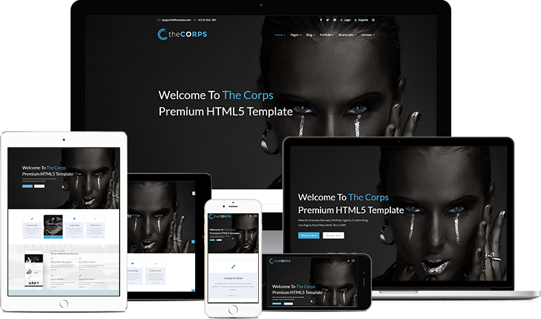
Responsive Websites | Image Source
“Responsive design” refers to the idea that your website should display equally well in everything from widescreen monitors to mobile phones. It’s an approach to web design and development that eliminates the distinction between the mobile-friendly version of your website and its desktop counterpart. With responsive design, they’re the same thing.
With the internet increasingly accessed from mobile devices, it’s no longer enough to have a static website design that only looks good on a computer screen. Not to mention, you also have to consider tablets, 2-in-1 laptops, and different smartphone models with different screen dimensions when coming up with a design.
So putting your content into a single column and calling it quits isn’t going to cut it. With responsive web design, you can make sure your website looks its best on cell phones, tablets, laptops, and desktop screens. All that improvement in user experience means higher conversions and business growth.
What?
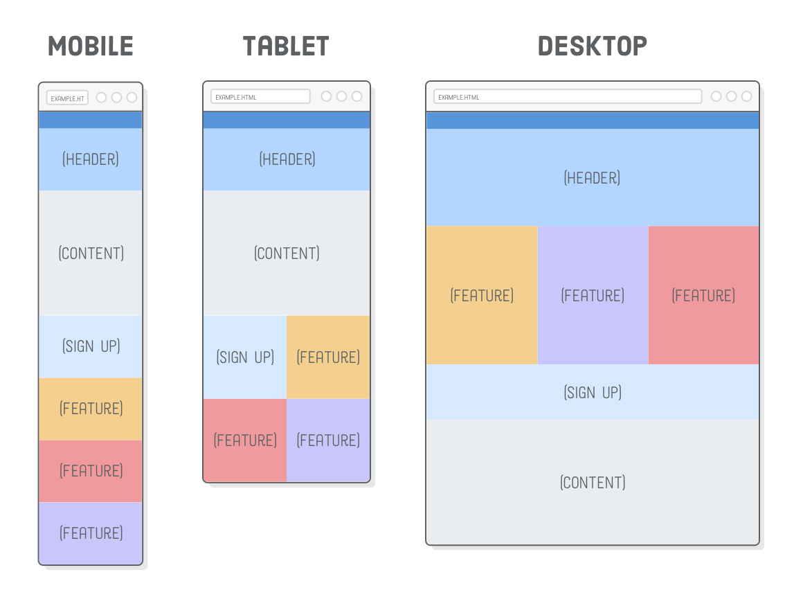
Responsive design is an approach to web design that makes your web content adapt to the different screen and window sizes of a variety of devices. For example, your content might be separated into different columns on desktop screens, because they are wide enough to accommodate that design.
In addition, devices have different features with which we interact. For example, some of your visitors will be using a touchscreen. The modern responsive design considers all of these things to optimize the experience for everyone.
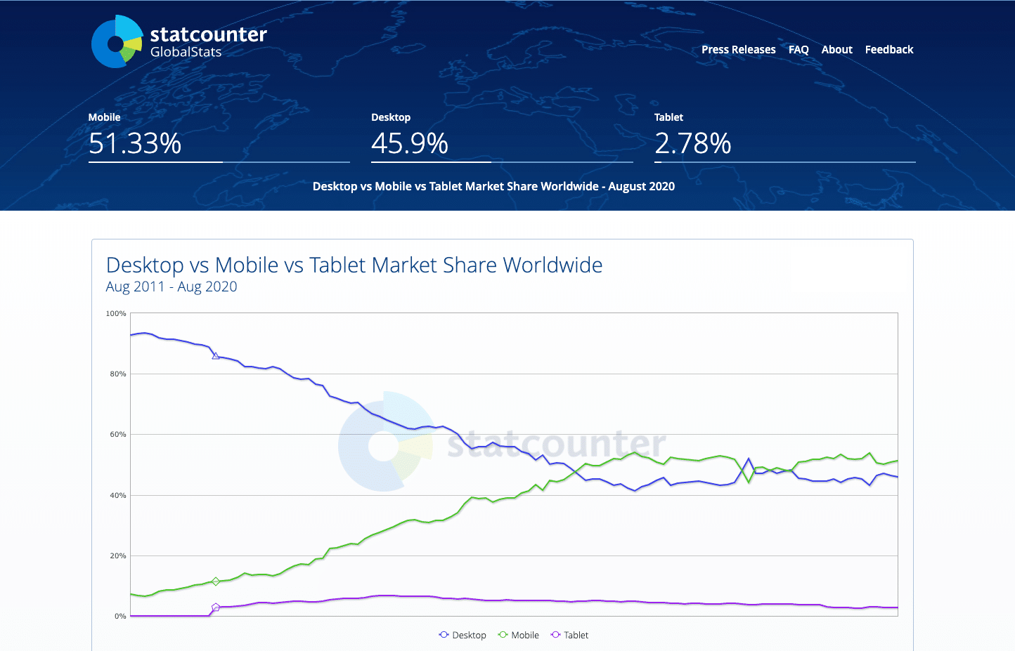
Mobile, tablet, desktop market share | Image Source
Why?
The reason is quite obvious nowadays, it is no longer enough to design for a single device. Mobile web traffic has overtaken desktop and now makes up the majority of website traffic, accounting for more than 51%.
When over half of your potential visitors are using a mobile device to browse the internet, you can’t just serve them a page designed for desktop. It would be hard to read and use, and lead to a bad user experience.
How?
Responsive websites can be built in many ways, but the foundations for the building blocks are:
CSS Coding Language
CSS and HTML
The combination of the two languages gave us the control of the content to design responsive pages. While HTML controls the structure, CSS will style the page. By adapting margins, font size, width, image size on the Media Queries, the resulting website will be responsive.
The combination of the two languages gave us the control of the content to design responsive pages. While HTML controls the structure, CSS will style the page. By adapting margins, font size, width, image size on the Media Queries, the resulting website will be responsive.
CSS Media Queries
Media Queries
This is the main part of CSS language that allows pages to be responsive. These codes are added to the CSS style sheet and it works in a similar way to an “if clause” in some programming languages, basically checking if a screen’s viewport is wide enough or too wide before executing the appropriate code.
This is the main part of CSS language that allows pages to be responsive. These codes are added to the CSS style sheet and it works in a similar way to an “if clause” in some programming languages, basically checking if a screen’s viewport is wide enough or too wide before executing the appropriate code.
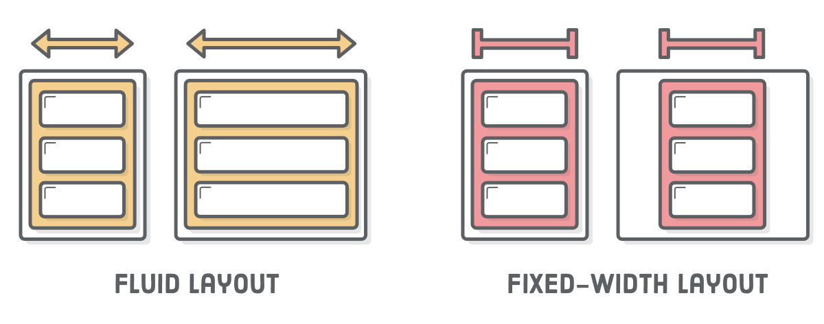
Fluid Layouts | Image Source
Fluid Layouts
A “fluid” layout is one that stretches and shrinks to fill the width of the screen relying on dynamic values, such as percentage. This approach will dynamically increase or decrease the different container element sizes based on the size of the screen.
A “fluid” layout is one that stretches and shrinks to fill the width of the screen relying on dynamic values, such as percentage. This approach will dynamically increase or decrease the different container element sizes based on the size of the screen.
Flexbox Layout
Flexbox is a CSS module designed as a more efficient way to lay out multiple elements, a
flex container expands items to fill available free space or shrinks them to prevent overflow. These flex containers have a number of unique properties, like justify-content, that you can’t edit with a regular HTML element.
flex container expands items to fill available free space or shrinks them to prevent overflow. These flex containers have a number of unique properties, like justify-content, that you can’t edit with a regular HTML element.

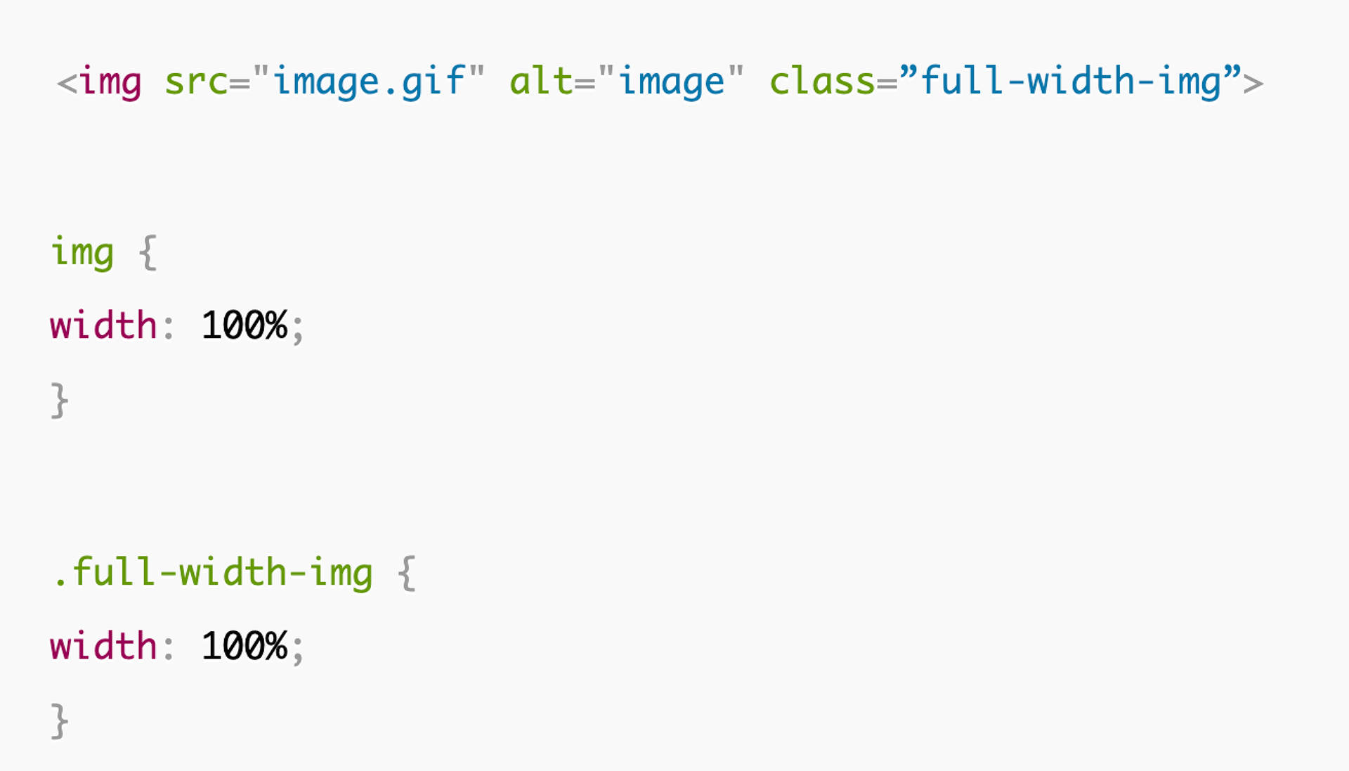
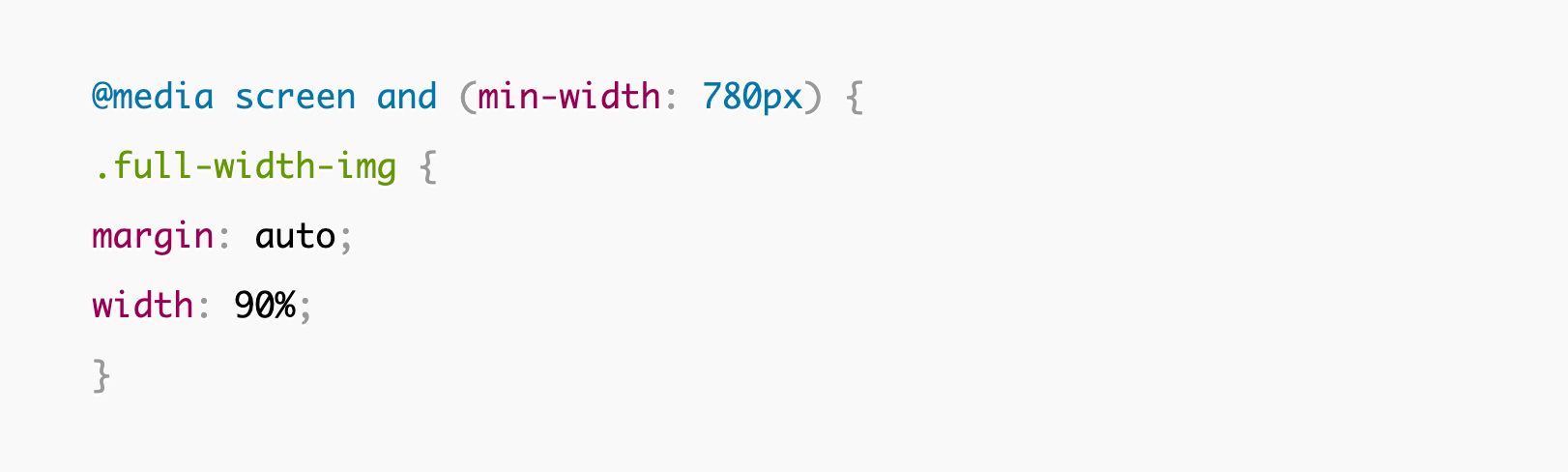
Responsive Image | Image Source
Responsive Images
The most basic iteration of responsive images follows the same concept as a fluid layout, using a dynamic unit to control the width or height. The % unit approximates a single percentage of the width or height of the viewport and makes sure the image remains in proportion to the screen.
The most basic iteration of responsive images follows the same concept as a fluid layout, using a dynamic unit to control the width or height. The % unit approximates a single percentage of the width or height of the viewport and makes sure the image remains in proportion to the screen.

Loading Screen | Image Source
Speed
Another huge factor to be taken into account is the speed that the page takes to load. Pages that load in 2 seconds have an average 9% bounce rate, while pages that take 5 seconds lead to a 38% bounce rate. Your approach to responsiveness must not block or delay your page’s first render any more than it needs to.
Things that we must consider to make pages load faster: optimizing imagery, implementing caching, minification and using a more efficient CSS layout.
There are a lot of different elements that go into responsive web design. Without a basic understanding of HTML and CSS, it can be easy to make mistakes, in our Interactive Design Course we are familiarizing ourselves with the different building blocks, analyzing the examples with web dev tools, and testing as you go using the sample code. Some key things we can’t forget to test after finishing a web page are:
Good Luck!
Tara Patterson Notes to Class | 27.09.2021